Published Tue Feb 21 2023
9 Tips to Create a Compelling Flat Logo Design
The flat logo design assumes a more minimalist approach to logo creation and uses straightforward typography, simple shapes, and clear colors to make an impression.
A flat logo is a two-dimensional logo without any complex design elements like gradients and dimensions. The flat logo design assumes a more minimalist approach to logo creation and uses straightforward typography, simple shapes, and clear colors to make an impression.
The flat design developed during the Swiss Style and Bauhaus movement of the 1900s and became significantly popular due to the release of Windows 8 and iOS 7. Many largest companies like BMW and Warner Brothers used flat logo designs.
Nowadays, they are even more popular. Businesses opt for simpler designs. Even though they lack complex design elements, they are still powerful when it comes to strengthening brand identity. If used correctly, they can make your business look creative and modern.
If you want to create a flat logo for your brand but don’t know where to start, you are in the right place. In today’s article, you will learn some simple but useful tips. So, let’s start.
Main Flat Logo Design Principles
Before we dive into how to create a flat logo design for your brand, it is worth getting a basic understanding of a few principles that can guide you when crafting a flat logo.
Below are the main components of flat minimalist logos:
1. Shapes
A flat logo design is characterized by geometric shapes. The most common shapes are circles, ovals, and rectangles.
Similar to logos with minimalist style, the goal is to make a distinct silhouette without any irrelevant details.
2. Typography
A flat logo usually uses simple fonts. It’s very uncommon to see any complex fonts, as they distract people from getting the message you’re trying to convey with your logo.

You can use Sans-serif fonts when designing a logo. In fact, it was the most popular font style used by 179 largest global brands (71․6%) in 2022. So, you can use them too, as they are simple and readable enough.
3. Colors
The flat design stays away from graphical elements like gradient colors, shading, and texture. You can use bright colors. You can use several colors, too, as long as they don’t make your logo look messy and chaotic.
4. Text
Even though you are trying to impress your audience with your design choices and visual elements, you still need some text to convey your brand message more effectively. But that doesn’t mean you should fill up your logo with a bunch of text.
So, try to keep your logo text short. Just take a look at Nike’s three-word logo, which proves you can say a lot with just a few words.
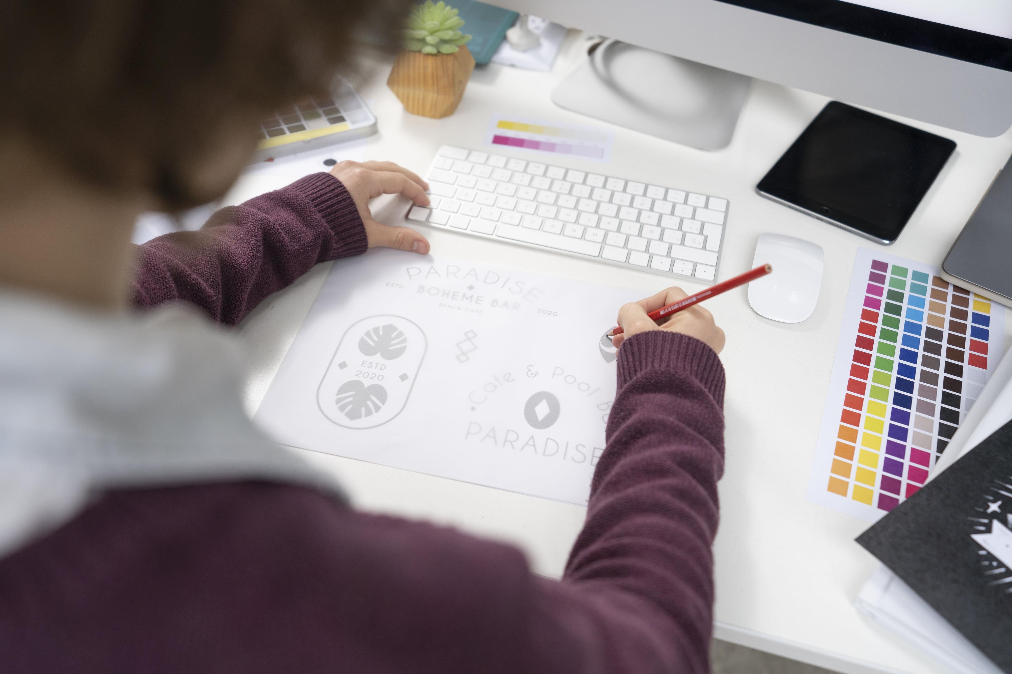
How to Create a Good Flat Logo Design in 9 Ways
Now that you know the history behind flat logos and what principles they have, it is time to learn how to craft visually appealing flat logo designs that will make your brand stand out and leave a long-lasting impression on your customers.
1. Do Some Research
Before you start making your logo, it is important to do some research. Indeed, you can do some sketching too, but thorough research is what stands behind every successful logo design.
A logo is a powerful branding asset and a tool for any business, as it allows them to tell customers about the brand, products, and services it offers. This is why you need to give thought to what design you create for your logo.
Reflecting on your company’s history, value, and vision is a good place to get started. You need to identify what makes your brand distinct to be able to create a logo that aligns with your brand’s image.
It is also a good idea to conduct a competitive analysis. You should find out what strategies and tactics your competitors used to create their logo design. This way, you will be able to understand what the audience likes and dislikes the most and use this information when crafting your own flat logo.
So, the more information you gather about your company and competitors, the more effective a logo you can make.
2. Get Inspired
Designing a logo might be challenging, especially when you have little or no experience. You might also lack fresh and unique ideas. Luckily, there are certain ways to gather inspiration and craft an awesome logo.
First, you can look at the logo designs of other artists. This will allow you to get some ideas and understand what design choices are trending at the moment. Don’t rely on your memory, and take notes to collect all the ideas that come to your mind.
You can also use Pinterest to get inspiration. There are many boards where users pin particular things they like. You can find boards related to logo designs too.
3. Make it Simple
Once you are done with your research and have good ideas for your logo design, you can start to create the logo.
As we have already mentioned, unlike other logos, flat logos lack complex visual elements. So, you need to have a minimalistic approach when creating your design.
Take a look at the logos of Microsoft, Google, Toyota, BMW, and other large companies. They all used simple design solutions for their logos. So, you don’t necessarily have to create a complex logo to make an impression. A simple and clear logo can still resonate well with your audience.
4. Choose Geometric Shapes
Shapes have a huge role in building a flat logo. Similar to a minimalist design, a flat logo’s goal is to have a distinct picture without any complex ornamental elements.

By using only a particular strong geometric shape, viewers won't get distracted by any other element in the logo. This way, people will be focused only on a single detail.
Choose shapes like circles, ovals, rectangles, and diamonds. They are simple but powerful in terms of visual appearance.
5. Pick the Right Font
When designing a flat logo, you should use a basic yet attractive typeface. You can use sans serif, for instance. There are many other beautiful and decorative typefaces, but they will not help you achieve the simplicity of your logo, and it will be harder for people to memorize your logo design.
So, use a font that will help people immediately graph the information your logo aims to communicate. If you fail to use the proper typeface, it will have a negative impact on your logo and overall brand image.
6. Use Color Contrast
Usually, a flat logo does not come up in several colors. Instead of using multiple colors, you can emphasize the contrast to make your design more eye-catchy.
It is not typical to use texture or gradients for such kinds of logos; using one or two colors will be the best choice.
Let’s take a look at Apple’s logo design. The brand uses only two colors: black and white. This contrast gives a strong and powerful appearance to the logo.
7. Try Different Sizes
When designing a logo, flexibility is really important. It implies that you should be able to change your design to any size that you want. A flat design is ideal for flexibility due to its simplicity.
So, if you manage to create a flexible logo, you can place it on large outdoor banners, headers of formal letters, and marketing collateral.
8. Ask for Feedback
Before you get your flat logo in front of large audiences and include it in your graphic design portfolio, it is important to ask for feedback to make sure you are not missing any important details. Sometimes, you might think that you have done your best and there is no room for improvement. In fact, there might be things you have overlooked. You can find out this only by receiving feedback from your friends, colleagues, and family.
If you are looking for more objective opinions, you can reach out to a professional graphic designer who can give you guidance and useful tips for improving your flat logo.
9. Revise
After asking for opinions and honest feedback from your friends, family, colleagues, and professionals, you can start revising your logo design.
Don’t rush. You might need several revisions before you achieve the desired results. When revising, try to experiment with fonts, sizes, and colors. This way, you can compare several designs and choose the one that best suits your brand personality.
Summary
Now that you know what a flat logo design is and how it can make a difference in your brand image, you can understand why it’s become such an essential concept for many businesses.
Regardless of the industry, companies have started using minimalist logo designs to appear modern.
Flat designs can draw your target audience’s attention and effectively communicate what your business is all about.
Indeed, it’s crucial to ensure you’re taking advantage of the benefits of flat design carefully. If you are not good at design, make sure to use relevant graphic design tools and software or work with a professional to achieve the best results.
Meri Minasyan
Content Manager