Published Fri Feb 03 2023
Tints And Shades In Graphic Design: Best Practices And Applications
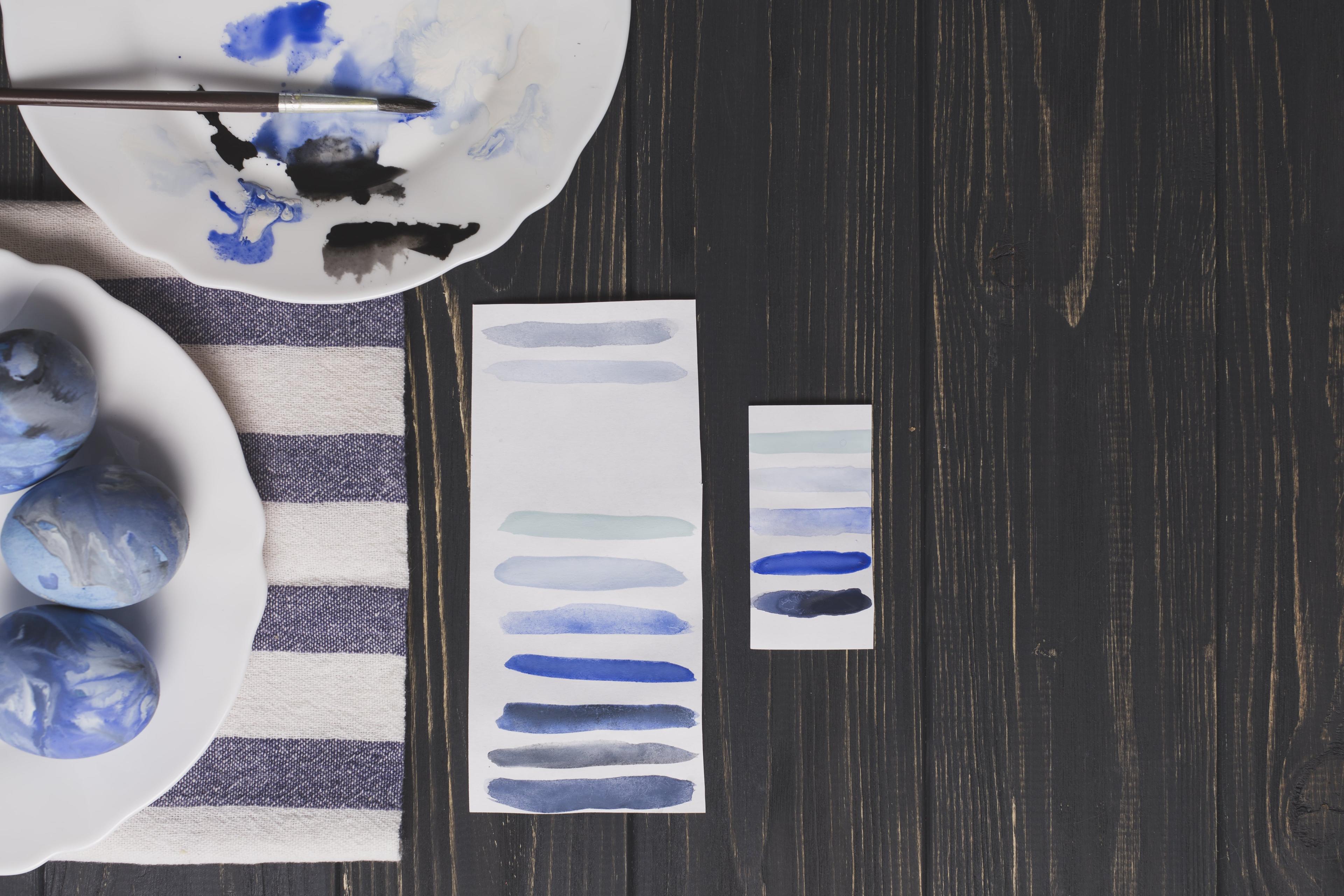
So, let’s get a closer look at how you can succeed when choosing the right tints and shades.
Choosing the right color palette for your design may be a little complex task. Between the right fonts, imagery, design approach, and other elements, color plays a huge role in the success of any visuals you create.
Even the black and white ones.
Since marketing, sales, and website development processes are about the consumer now and making it easier for users, your audience's expectations should affect even the color schemes you pick. According to statistics, 21% of consumers will leave your website if you lose “outlandish” colors. Meaning, color palettes that are entirely unfamiliar to them.
So, imagine what the wrong color scheme can do to your company. You shouldn’t also forget the role tints and shades play in this situation because they make up the whole color scheme for your website, social media profiles, poster and packaging design, and other spots where you use your brand design.
So, let’s get a closer look at how you can succeed when choosing the right tints and shades.
The difference between tints and shades

Imagine you have some colors at hand, let’s say blue and green. What if you’ve researched and found out that your audience actually prefers a lighter green or a darker blue? You simply create and deliver it to them.
A tint is when designers and artists add the color white to another color to make the latter appear lighter. For example, if you add white to the usual blue, you will most likely get a baby blue which is a tint for blue.
A shade is exactly the opposite of tint. This is where designers add black to the main color to make it appear much darker. For instance, if you need to create a deep and dark forest illustration, you would add black to the above-mentioned green and make it appear much darker.
In other words, playing around with hue effects can make or break your whole design. How unfair, right? But not really, because we’re about to explore the different ways you can implement the practice of successfully creating the right colors for your designs.
Tips to apply tints and shades into your designs

At this point, you may already have some ideas of what color palette you should use for the given designs. Now, it’s time to explore some fresh ideas of how exactly you can use that palette.
Even if you’ve picked the perfect coloring, implementing them into your design can be a complex task. So, let’s learn about it together!
Play around contrast
Contrast is all about the differentiation of your visual elements in the design, and that’s how it should be treated when it comes to tints and shades. For starters, you can try to pair a dark shade with a light tint. During this process, it’s important to keep in mind how well warm and cool colors can play together and help you achieve a deeper design.
When is the best to use contrasting shades and/or tints? One of the most popular cases is when a brand wants to create and share something slightly different or progressive. So, by keeping their main colors, they can create various pallets and achieve a better outcome after all.
Use blending techniques
Mixing or blending is the way to go when you want to play with colors. To create the tints and shades effect to one color or another, two different colors are mixed, and the output is a transition color. The trick with blending paints is to mix colors when they are wet. In the case of graphic design and web designing, the blending techniques work anytime.
Gradient Blending is a common blending technique that creates a smooth transition between two colors. Another technique is color dodge or burn, i.e., lightening or darkening one image based on the colors of another. Masking, in turn, uses a mask to define which parts of one image are visible and which parts are hidden. Compositing is combining multiple layers or images into a final composition that can apply to colors as well.
Don’t forget about simplicity
Simplicity is inseparable to an elegant design. Prioritize simplicity. Using too much shading or tint effect can make the design cluttered and overwhelming.
Instead, choose a limited color palette. This allows the design elements to stand out and creates a harmonious and cohesive look. Additionally, consider the context and purpose of the design and choose tints and shades that complement or contrast appropriately. You will encounter it in many tips for photo editing.
Add depth to your designs
Adding depth to designs through the use of tints and shades can elevate the overall look and feel of the design. By creating a gradient of lighter and darker variations of a single color, you can create a sense of dimension and depth in your design. For example, applying shadowing and tints to elements such as shadows and highlights can give the illusion of three-dimensionality in a flat design.
Another way to add depth to your designs is to create contrast. By using a high-contrast palette of light and dark, you can draw attention to specific elements in your design and create visual hierarchy. For example, using a light tint of color for the background and a dark shade for text or other design elements helps to make the text pop and stand out.
Gradients are always around
Gradients are a visual transition between two or more colors. They can add depth, movement and interest to your designs. In graphic design, gradients are often used to create backgrounds, add dimension to flat designs, or to make text or other elements stand out. Gradients can range from subtle and seamless transitions between colors to more pronounced and dynamic transitions.
They can be created in various directions, such as linear or radial, and can also be blended with other design elements to create unique and eye-catching designs. When using gradients, it's important to consider the overall look and feel you want to convey and choose colors that complement each other. A well-designed gradient can add depth and visual interest to your designs and take them to the next level.
Create unique patterns
Creating unique patterns involves playing with the lightness and saturation of colors to create variation within a design. The steps involve the following:
- Choose your main color: Start with a hue that you like and build your pattern around it.
- Create tints: Add white to the base color to create lighter versions of it, or tints.
- Create shades: Add black to the base color to create darker versions of it, or shades.
- Experiment with different ratios: Try adding more or less white or black to create various tints and shades, and experiment with different ratios to see which look best for your pattern.
- Layer the colors: Once you have a range of tints and shades, layer them in various ways to create unique patterns. You can use stripes, dots, or other shapes, or play with the placement and size of the colors.
- Add texture: To add an extra dimension to your pattern, try adding textures, such as stippling or crosshatching.
By playing with the lightness and saturation of colors, you can create a range of shades, hues, and tints that can be combined in unique ways to form patterns with visual interest and depth.
Wrapping up
Such a long journey we went about the topic of tints and shades. In this quick guide, we discussed the main differences between these two concepts and gave some fundamental tips on how designers can integrate them into their works. Additionally, we discussed how these elements can elevate your design.
Don’t underestimate the power of color, do your homework on what visuals your audience expects, and make sure to add it to how your brand looks online or in print. Hopefully, you found something interesting and useful in this article that you will try for the next design.
Meri Minasyan
Content Manager